CANCEL
2018-11-06 16:18:03
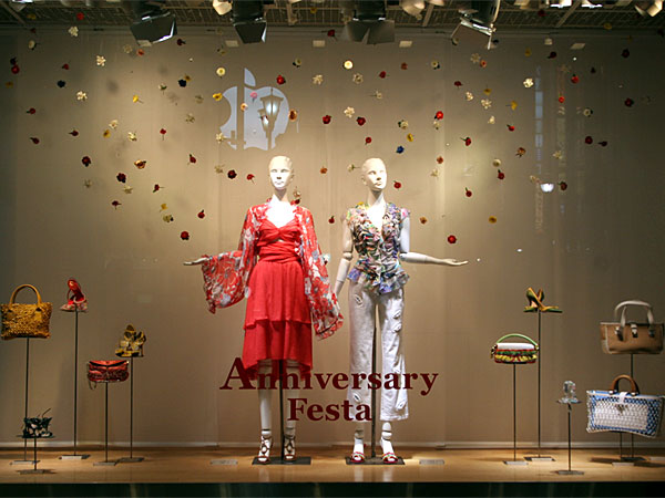
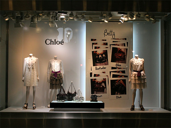
Color is the first feeling of viewing from a distance. Color conveys information is faster than graphics and text. The color of the window design includes clothing, display props, floor and wall color, etc. Color matching of the ground, wall and props is to highlight the clothing. The visual impact on the customer is not based on stronger color contrast. Snatching a person's sight to leave a deep impress, which is also a misunderstanding. The following window picture is an example.
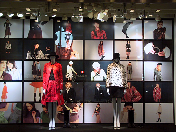
Human visual physiologyshows that people have a function of self-protection.Our brain dislike chaotic. Strong contrast of color makes the human vision immediately enter the defensive state, consciously resist the dazzling color, at the same time, our brain will be tired up of it. So, if you want to impress your customer by color contrast, it will lead to a opposite outcome.
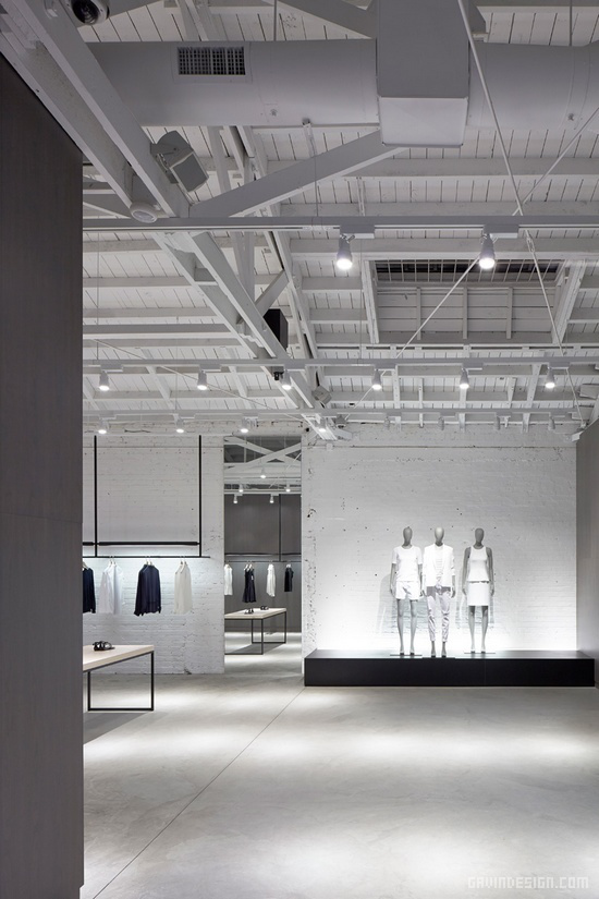
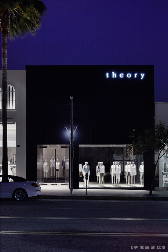
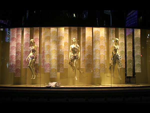
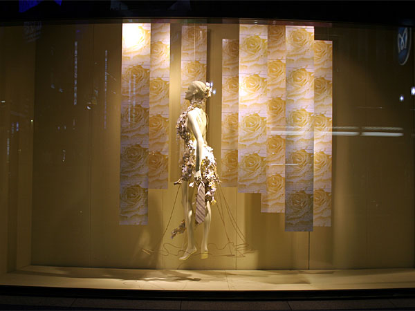
Therefore, many famous brands and big companies usually choose very simple, refined and harmonious colors. Most of them would like to take monochrome to represent the company image so that people can easily remember it.
There are pictures of well-known American clothing brand Theory flagship store in Los Angeles.