CANCEL
2023-10-13 15:58:42
Do you believe that a lot of stores have a very gloomy, monotonous appearance? If so, the main culprit is probably a poor use of color; as a result, we may start with color in our store to instantly make it seem "big" and vibrant.
In accordance with the color tone around the store's color, we may change and identify the items. The steps listed below can be used with the color display method:
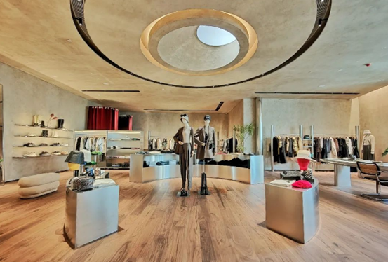
First tip: Light colors will make the room appear more bare. In the same way that the clothing is shown, the store with white walls will appear larger than the one with black walls. It will appear more vacant if we wear mostly light colors like white. When we use mostly black clothing, the display will be empty, the space between each piece of clothing will be increased, and some mannequins will be utilized to exhibit the apparel, which will also make our products appear more sophisticated!

2. It is recommended to use no more than three major tones. The greater the impression of loudness and the more intricate it appears, the more tones there are. More than three colors, particularly the dominant hues of fall and winter, will seem disorganized and unfocused, and, conversely, will make buyers feel cheap.
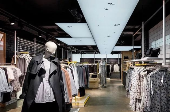
Skill 3. Keyboard displays that alternate between two shades of color, such as black and white, dark coffee and light coffee, etc., are a skill 3 color display style that is ideal for the fall and winter. The store looks elegant and rhythmic thanks to this display. dynamic. When wearing a lot of dark clothing, we may modify the spacing and strategically use white to break up the monotony that dark hues can cause. The presentation of colors in gradients from light to dark and vice versa. It may effortlessly convey a feeling of vastness and has great regularity. It is quite useful for our little store to utilize! Of course, the recommended direction for gradient displays is from light to dark. The rationale for this is that seeing is more natural when done from left to right. The door can be presented shallowly and inwardly, giving the impression that the long, thin store is extending.
