CANCEL
2023-04-24 11:03:41
Arouse the interest of customers,
First and foremost, we need to make the storefront more appealing.
The storefront is what people notice first, therefore creating a visually appealing front entrance should be your first priority. Because window mannequins, colors, and forms are the most powerful visuals, visuals account for 90% of how consumers process information.
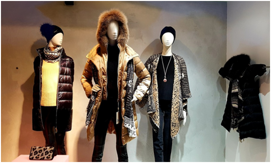
Pick mannequins that go with the décor or the attire.
If you want to display sportswear, for instance, you should pick some sports mannequins with dynamic effects to demonstrate the dynamic impact of the apparel and enhance the vividness of the item.
Mannequins can still be used by commodities retailers to make more eye-catching display displays that tell stories to draw in passersby.
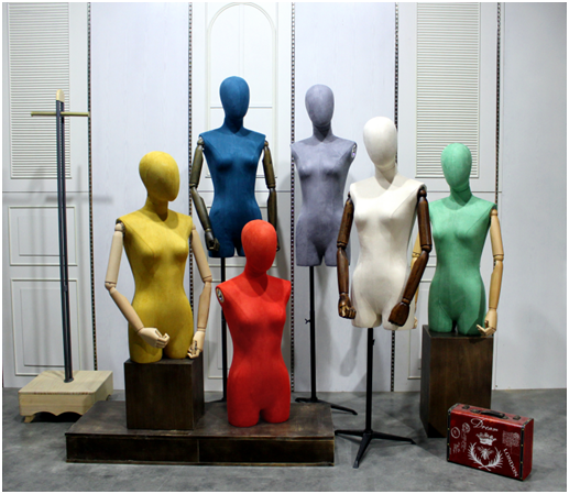
In store windows, mannequins have traditionally been the most popular and useful display props. The most comprehensive mannequins are those made by AFELLOW, which provide tens of thousands of customizable designs.

Choose the VI color of the brand.
1. People often associate a hue with a particular company, such as Tiffany when they see lake blue.
Orange will cause you to think about LV. Use vibrant hues; after all, Hermes orange has long driven ladies wild.
Because we are all "color-loving animals," individuals find brighter colors to be more appealing.
Particularly this sort of color spreading over a big region will also produce a visual shock that prevents people from stopping and starting.
2. Select various colors
Physical stores nowadays are quite homogeneous, regardless of the goods they offer or the layout of the space, which makes it simple for customers to develop aesthetic fatigue.
But a wise shopkeeper understands to "change the color" and implement certain modifications.
Select a color for the store's front that sets it apart from the one next to it so that it may be easily identified on the street by its consistent color tone. The appropriate form may become firmly ingrained in people's hearts, and the right hue can quickly attract their attention.

These three factors serve as the foundation for choosing the store door's shape:
1. Make your selection based on the VI's shape.
Consider the most straightforward illustration: a large yellow M that signifies McDonald's to consumers even from a distance.
You can identify Nike clothing by the tick. These door header designs have a strong association with the brand VI and leave a lasting impact on clients.
2. Choose according to local cultural characteristics
For example: Starbucks, in different places, it will set up the gate and store environment according to the local cultural characteristics.
The overall design of Starbucks in Shanghai Sinan Mansion has a strong republican style and looks full of charm.
The Starbucks at Disneyland looks very Disney. It is different from the usual Starbucks store, but it gives a more novel feeling.
3. Make the shape according to the main dish. For example, a bakery can paste the shape of the cake on the door, which will make people's eyes shine and let everyone know that it is a bakery. This method can also be used in milk tea shops or other shops.
Now that the development of e-commerce is getting better and better, the business of physical stores is getting worse and worse. If the store does not have the ability to attract customers into the store, then you can only be eliminated by the times.
But some brick-and-mortar stores can double sales during that time. Why?
Because they already have enough customers, and they are still trying to attract more customers, only when customers enter the store, they will make a purchase.