CANCEL
2021-02-23 17:24:06
When designing a ‘ Presentation space’, some stores are more willing to design the theme as a life scene, so as to shorten the distance between the customers and allow them to have a better experience.

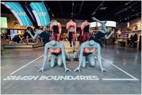
In this store like New Balance, the‘ Presentation space’ is designed to be close to life. Models wear the clothes in the store to make a running posture, as if a group of people are competing.

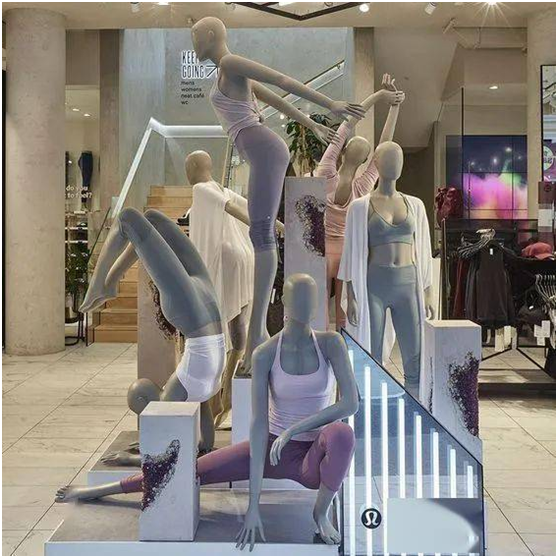
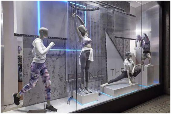
The "visual point" setting of lululemon looks more vivid.

Whether in the store or outside the window, the mannequins are wearing yoga clothes, simulating the actions of customers doing yoga. This is a good way to put life scenes directly into the store for ‘visual point’ design.